A Boston Hospital Mobile Portal Redesign
The hospital we collaborated in this project found a large amount of inquiries increasing the customer services team’s workload. I worked with two other designers. Within strict restrictions, we redesigned the Login, Home page, and FAQ webpage by restructuring information architecture and wireframing. Through conducting usability tests, stakeholders interviews, we finally validated our design making the platform more intuitive and reduced users’ confusion when using the mobile portal successfully.
Time: 3 months
My Role: UX researcher and designer
Methods: Site map, Usability test, Wireframing, Prototyping
Background
The hospital offers a digital platform for patients to view health records, manage visits, pay the bills, and interact with the care team. However, the support team of the platform received a large number of support tickets from users. This indicates user confusion and creates extra work for the support team. Moreover, the team found that more than 60% of users access the portal from mobile devices. Hence, the mobile portal was the main object in this project.
Design Challenge
Through analyzing a large number of support tickets and the information architecture, we found that the platform faced several challenges:
The current instructions failed to guide users to find their needs through the portal effectively.
The navigation design was confusing for the users when they were looking for support.
The design and the content of the portal weren’t consistent since the portal was owned by three different units.
Goal
Figure out how we might restructure information within the mobile portal so that users can easily find what they need.
Redesign the Login, Home page, and FAQ webpage.
My role
During this project, I worked with the other two team members. We shared the whole research and design process. My contribution included:
Restructure information architecture
Ideation
Wireframing-Login process
Prototyping-Login process
Usability testing
Presentation
Solution
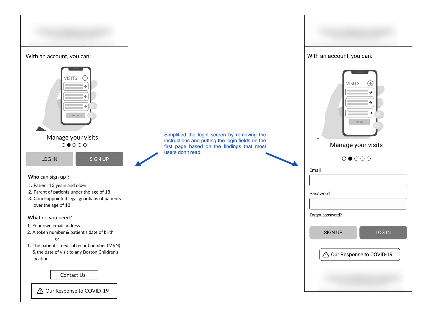
Log-in
Problems:
Information such as the key benefits of the portal, who can have an account, technical requirements, and how to sign up aren’t displayed clearly to the users.

Home page
Problems:
Users would like to learn of any new features and improvements of the portal.
Additionally, it was not possible to navigate the portal in Spanish.

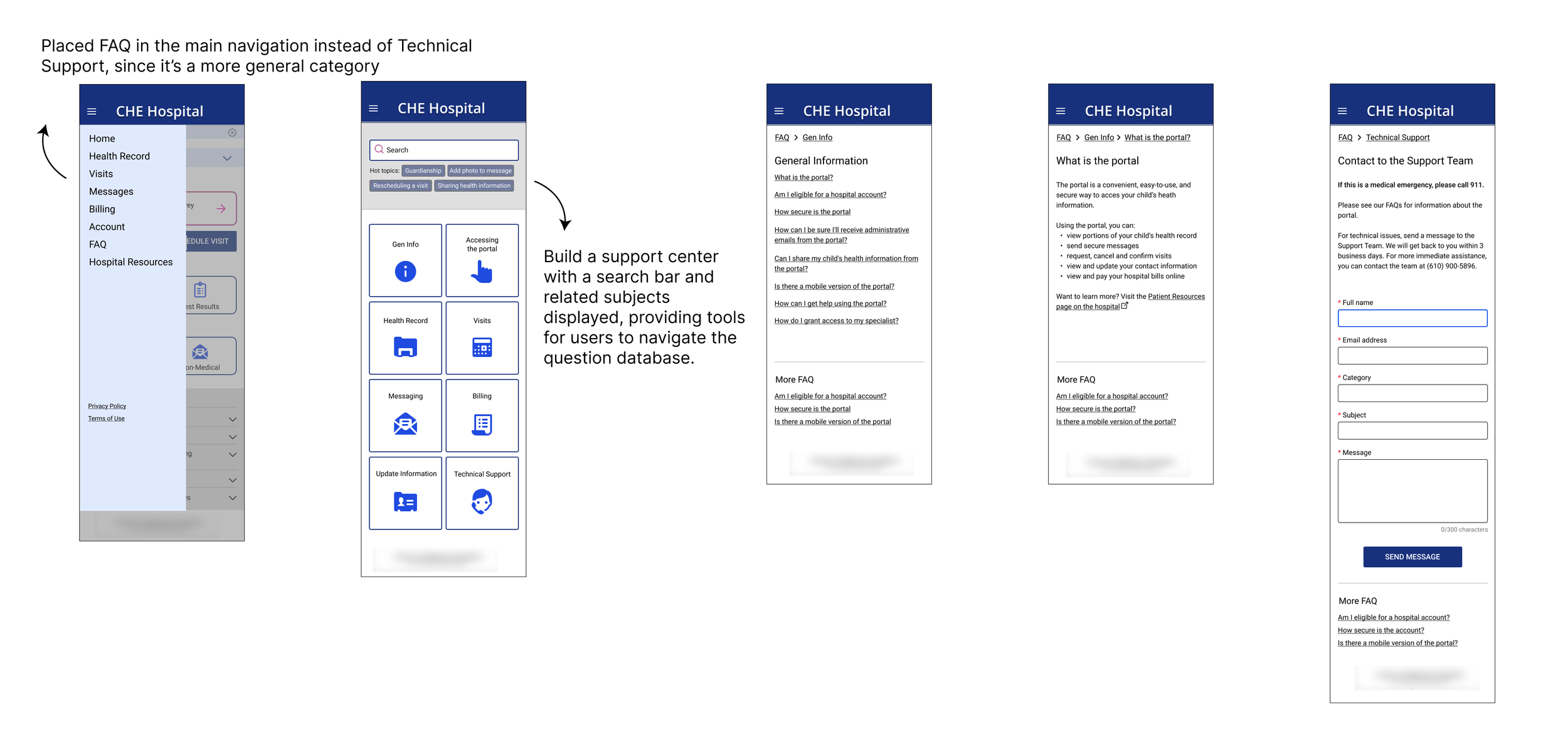
FAQ
Problems:
FAQ was under the Technical Support page, which made it difficult for users to find support when they have questions.
Information was scattered, which was hard for users to find information they need.
The Design Process
As a designer working on an existing product, we began the project by conducting a series of research studies.
Site map
The site map helped us understand the breakdown of the site, and also identify improvements to the information architecture.

Usability testing & stakeholder meetings
After the initial research, my team created the first version. We conducted the usability tests on over 20 participants and held stakeholder meetings to integrate the design process and design validation.
These are the overall findings:
Users tend to skim or avoid reading
Iconography is an effective way to guide users
Large images can affect load time
In-line notifications can cause confusion and distraction
These findings served as the design principles and guided me when building out the user flows.
Iterations
Take the log-in user flow for example, we redesigned the log-in process based on the results from research.
We simplified the log-in screen by removing the instructions and putting the log-in fields on the first page based on the findings that most users don’t read. Thus, users can log in to their account directly without being bombarded with text or having to begin the sign-up process in another screen.
Instead of putting all the guidelines on the first page, we decided to divide the sign-up process into four steps and merged the requirements into it.

Result
We proposed changes to the navigation and reduced verbose language with titles, sections, and iconography. The proposal will decrease the users’ cognitive loading in the using process and relieve the support team’s workload. The presentation received great feedback from the sponsor. They specifically praised how the sign-up process was improved by decreasing the cognitive loading.
"It indeed helps us shorten the sign-up process and solve the current confusion.” - Sponsor
Takeaway
With an experience that dived into the design principles and communication section of the hospital portal, I’ve mastered strategic thinking and how to design with restrictions through collaborating with the support team of the hospital. This allows me to think critically when designing a scalable complex system of healthcare.
If I had more time, I would love to test the final version with more real users, such as parents or children who are over 13 to validate the design. Also, I would like to explore the using context that weren’t considered in the design due to time constriction, such as designing for parents who have multiple children.