
Hiking Biji App Redesign
Collaborating with a partner, I identified usability issues by interviewing and observing users’ behavior when using the Hiking Biji app. Based on the result, I redesigned the home page, search filter, and route search function of the app. Finally, I conducted a usability test to validate our proposal and made an iteration.
Time: 6 months
Role: UX researcher and designer (Team of 2)
Methods: Heuristic review, Interview, Persona, User journey map, Usability test, Prototyping
Tools: Figma, FigJam
Challenges
Hiking Biji is the largest hiking guide website in Taiwan. It also cooperates with the local government to hold missions, encouraging Taiwanese to walk into the nature. Since the app contains diverse functions and special missions, it has become a necessary tool for outdoor lovers.
However, I observed that even though users realize the app is equipped diverse functions, they only use basic functions such as looking up information and finishing exclusive missions due to its confusing design.This motivated me to identify any usability issues and propose solutions on the critical features of the product.
Design Process
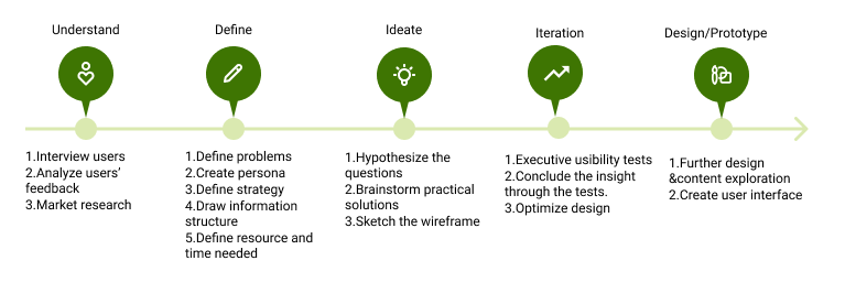
User Research
To understand what users’ experience are during using the app, I gathered their perspectives through three methods:
Reviewing users’ feedback on App store and Google Play.
Executing individual interviews with users.
Evaluating Hiking Biji with usability heuristics.
Based on the feedbacks, I portrayed the persona and user journey map.

Information Architecture
I learned the problems as following by drawing the information architecture.
Unintuitive visual hierarchy
Functions and information are hided by multiple visual hierarchy, which are confusing.Inconsistency
The function of icons and buttons were inconsistent between different pages, causing misunderstanding.

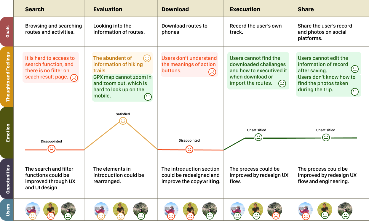
Research Insights
Unclear instruction
When looking up the information of missions and trails, users feel lost since the instructions aren’t clear.
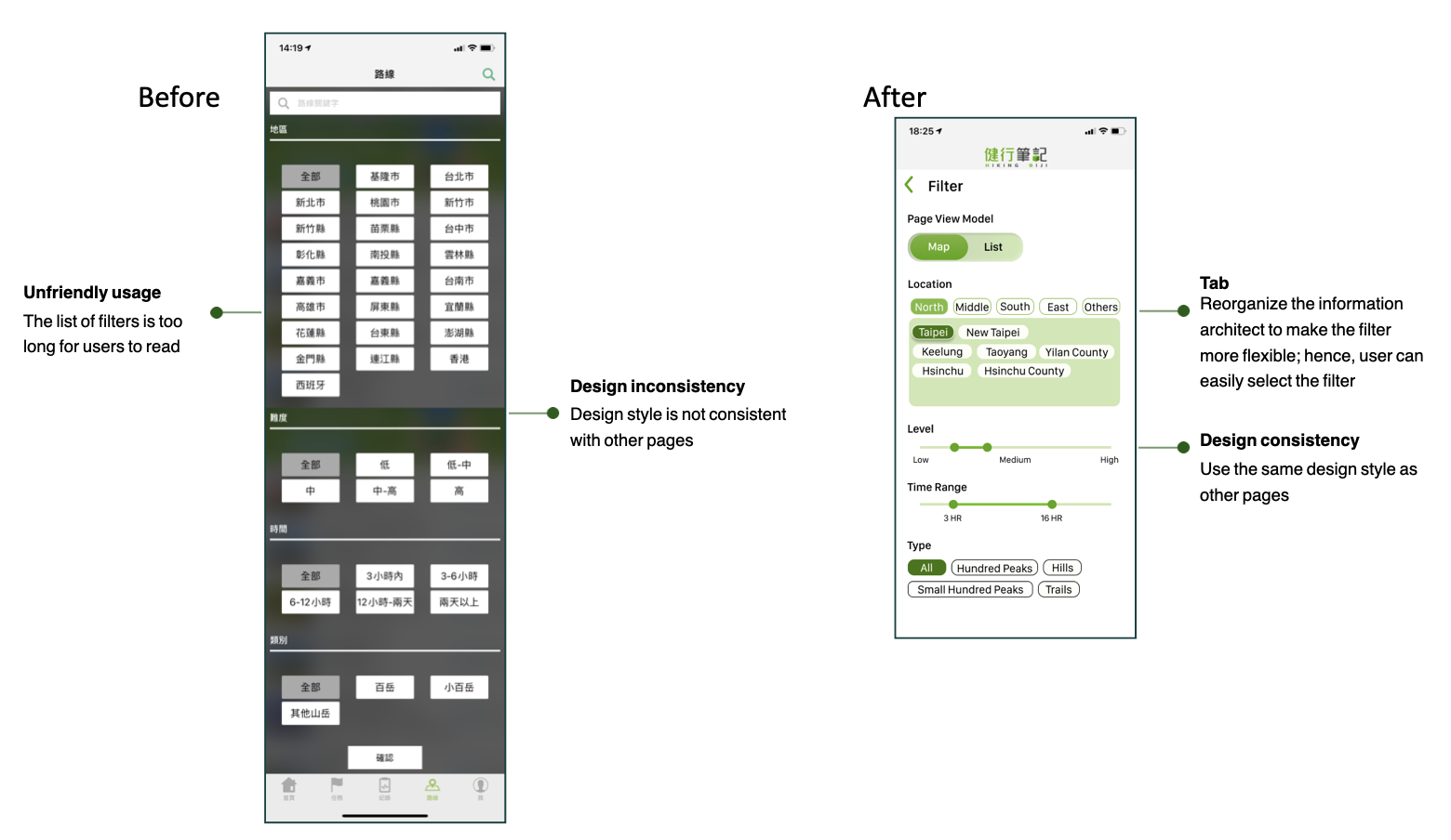
Unfriendly search filter
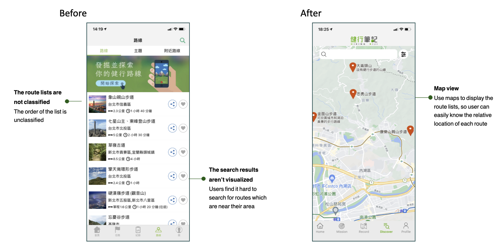
Users cannot access their search results directly without filter. They are only able to swipe up and down to view the route introductions.Complex information structure
In general, users know Hiking Biji contains many functions. However, they also feel that the app is complex since they don’t know how to access the functions.
Wireframe
To tackle the problem, I pictured wireframes with my partner.

Usability Test
After drawing out the wireframe, we conducted two usability tests and discovered the room for improvement:
1. Filter selections are limited.
2. The buttons of start, pause, and save in the record page aren’t intuitive.
3. The information on the SOS page is low in readability.
4. Users wish to see other hikers’ comments displayed in the trail introduction.
Selected Solutions
Home Page

Search Filter
Route Search
Learning and Takeaway
I gained rewarding feedback from the project.
Clear hierarchy and unified icons are essential to guide user to explore the application.
To bring the maximum value to users, we did a usability test with low validity prototype, involving users’ latest feedback in the later process. We were able to make sure the notion indeed improve the user flow.
Communication between team members is the key successful factor of the project. One of us is familiar with research methods, and the other one is good at design. We are able to complement and respect each other.
I received a fulfilling lesson from the experience. Although this is a side project to practice my research and design skills, it won’t to be the end. I plan to sent it to the app company for their feedback. I believe that it would be interesting if there is any chance to hear from perspectives from the company.